Name the companies behind each logo. Continue with part 2.
I got 27/36 & 26/36.
Share your scores in the comments!
[found via Coudal]

Name the companies behind each logo. Continue with part 2.
I got 27/36 & 26/36.
Share your scores in the comments!
[found via Coudal]
A brief overview of my life in logos:
|
Which logos would tell the story of your life?
![]()
Already many times discussed at f.i. Brand New and LogoDesignLove ánd made fun of (brilliantly by Lawrence Yang) there’s not really much to say anymore about the new 2009 Pepsi logo. Some like it, calling it a smiley or Pac-Man, some utterly disliking it, calling it a p*nis or, like Yang, suggesting it’s a fat tummy. Like it or dislike it, the new logo certainly arouses reactions all over the Net and I have not even seen it in real life yet! Not until very recently in 2009 it did not even show on pepsi.com; while the buzz was already out and wide spread among blogs at the end of 2008. For a moment I even doubted it there really was a new logo. The logo could just be created by someone and posted on a blog, the images of cans and bottles with the logo rendered with the help of a 3D ray-tracing program, etc. Confusion all over. That alone might have justified another rebranding by Pepsi.
Personally I think Arnell Group did a very good job. The new logo is clean, smiling at you and very well to apply on packaging, vehicles and everything else that’s brandable. I like the new thin typeface very much. Pepsi doesn’t look like a brand from the 80s anymore. In times of rebranding every single logo to a web2.0 version, I think Arnell, not conforming with these ‘new trends’, beautifully transformed the 3d Pepsi circle to a stylish flat and strong logo.
Like many others I could talk on forever about the new Pepsi logo, how it’s been differently used for Pepsi’s different products, it looks like a Korean logo, etc., or we can all just see how well the new logo is appreciated…
Of course you can also leave a comment with your thoughts about the logo right here.
 Yesterday, the day of this year’s Super Bowl, the logo for next year’s event was unveiled.
The logo is dominated by the roman numerals XLIV (next year’s Super Bowl will be the 44th) with the word Super over the XL and Bowl over the IV. Roman numerals have formed part of all Super Bowl logos except the very first one.
A goal sits in between the L and the I to divide the logo in two parts. A football is seen flying in between the goal posts. As has been the case in recent years red and blue stars represent the American and National conferences of the NFL.
The orange color is said to be a nod to Florida, as the game will be held in Miami next year.
 Speaking of logos for one-day events, here is the logo for this year’s NBA All-Star Game will be held in Phoenix in two weeks.
The lifetime for this logo is short, like the Super Bowl logo. Its purpose is also to appear on merchandise realted to the event, but on a smaller scale as its Super Bowl counterpart.
Even so I think it’s a nice logo, with references to the Arizona desert and nods to Phoenix’ own NBA franchise in the purple and orange colors.
![]() I like to share something with you. At goodlogo.com I hooked up the tagging of logos with our new Logo Memory game. Alberto being bored and not wanting to do any work on his graduation project already wrote the memory and slide puzzle javascripts back in 1999 for our team basketball site, Heren5. End of last year while working on the tagging section on goodlogo.com, I wanted to add some extra visual interface or output to the tagging to, in a more fun way, enjoy the beautiful subsets it came up with. What better fun than a game. A logo game! Having looked around on the internet for Flash or Ajax prêt-a-porter games, I was disappointed about the quality and look-and-feel of these games and also wasn’t looking forward to maintaining a Flash .fla and its actionscript. As far as I know, you can’t f.i. do an easy svn diff on a .fla. And then it hit me, why not take some really clean and easy to understand (thus: to alter) javascript that has already proven itself for almost ten years now. I took Alberto’s javascript and added some scripting so that it would automatically pick a subset of logos before shuffling the cards.
I like to share something with you. At goodlogo.com I hooked up the tagging of logos with our new Logo Memory game. Alberto being bored and not wanting to do any work on his graduation project already wrote the memory and slide puzzle javascripts back in 1999 for our team basketball site, Heren5. End of last year while working on the tagging section on goodlogo.com, I wanted to add some extra visual interface or output to the tagging to, in a more fun way, enjoy the beautiful subsets it came up with. What better fun than a game. A logo game! Having looked around on the internet for Flash or Ajax prêt-a-porter games, I was disappointed about the quality and look-and-feel of these games and also wasn’t looking forward to maintaining a Flash .fla and its actionscript. As far as I know, you can’t f.i. do an easy svn diff on a .fla. And then it hit me, why not take some really clean and easy to understand (thus: to alter) javascript that has already proven itself for almost ten years now. I took Alberto’s javascript and added some scripting so that it would automatically pick a subset of logos before shuffling the cards.
After adding some score calculation and duplicating the amount of logos on file last month, I think we got ourselves a cool game. Please check it out. The basic level serves any logos, the intermediate level serves logos having at least one tag in common and the advanced having at least two tags in common. Thus making the differences between logos in the subsets smaller and smaller and for you harder to inter recognize and to remember differences.
After building this logo memory game in a flash, I felt like wanting more and started playing around with the slide puzzle featured on the Heren5 site and thought why not also brand this as a logo game. What a joy cutting up all those logos with the Photoshop shredder… I have to say Slide Puzzle is not as cool as logo memory, but maybe that’s because I can’t seem to get past level 2. Perhaps you can? Good luck!
But be sure to start with the Logo Memory first, it’s far more enjoyable.
I understand if you don’t have the time or patience to play a cool game of logo memory, in this case you can also hit the ‘surprise me’ button on goodlogo.com or whilst in the tagging section click ‘random tag’ or ‘random multitag’ links. This will also serve you with a cool subset of logos, only I can’t guarantee you it will be exactly ten logos.
Happy Gaming!
 Coming Sunday the Pittsburgh Steelers and the Arizona Cardinals will play in the 43rd edition of the Super Bowl, the biggest sporting (and television) event in the United States.
The Super Bowl logo is a strange animal. It is designed for a single day event and is immediately forgotten afterward. But in its limited lifetime it is printed on an estimated $100 million worth merchandise.
The New York Times has a nice piece on the design and background of the Super Bowl logos, complete with an overview of all the previous logos. There’s also a slideshow of alternative logos.
And yes, this year’s logo does indeed bear some similarity to the Bank of America logo!
 The Brand Beer label evolution overview that’s new in the Design Cases at goodlogo.com is based on a poster I once saw, and grabbed… Ohhkay, sounds like I have to confess now…
About 5 years ago on a Friday afternoon I was doing an ‘after-work-drink’ with my very good friend Leighton (from RED) in our favorite pub the Wijnhaven in Delft. As Leighton is a Welshman and just like in England, in Wales the pubs close at 11pm sharp, Leighton always sees to it, by 11pm we have enough alcohol consumed to be, as Leighton calls it, completely ‘pissed’. To achieve this goal and not to be constantly ordering drinks at the bar, we always drink pints together.
No other deal this Friday, except that it was exceptionally good weather and that everybody, included ourselves, were sitting outside at the terrace in the beautiful city center of Delft. Being served by our favorite Wijnhaven waitress and having our favorite dish served, the Wijnhaven saté, the beers tasted great that evening.
 Drinking beers always makes me go to the toilet and once you start, it’s hard to stop. On my first way to the toilets in the basement of the pub, I saw a very cool poster, displaying the beer bottle label evolution of the Brand beer brand. No I did not steal it. Not immediately. Not until many drinks later and many toilet visits later, I started to think how cool this poster would serve as input on goodlogo.com…
Because it was such beautiful weather and because Leighton always makes sure we start drinking early enough, at the time I was completely ‘pissed’, everybody was still sitting outside enjoying the weather. Because of this there really was nobody in the Wijnhaven itself, and that’s where and when I saw my chance… The poster was mine.
Next Monday I took the folded poster to work and put it in our new super deluxe scanning device, this machine uploaded it to my desktop and then … nothing. For many years really nothing happened, until yesterday I came across these scans on my computer and thought about the heroic act in acquiring this super design case material. So I put it in the Photoshop shredder et voilá, we got ourselves a new Design Case, Enjoy!
I hope sharing this great Brand material with you all makes up for my theft…
Leigthon, I miss you (and our drinks) in Holland, hope to visit you soon in Italy!
![]()

End of December I got my new 2009-member card for the ANWB (the Dutch drivers’ association) in the mail, but I only recently threw the old 2008-card out. That’s when I noticed that they had a new logo!
The logo was introduced november 17 last year during the celebrations of the ANWB’s 125th anniversary. It was developed by Millford Brand-id and it should symbolize the leading and guiding (the compass!) character of the ANWB regarding her members.
Using an italic fontset the logo should stand for dynamic and forward power.
The old logo had been in use since 1983.
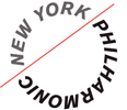

Both Brand New and logo design love point to the redesign of the New York Philharmonic logo.
The redesign was done by Paula Scher of Pentagram. You can read a detailed write-up of the redesign on the Pentagram blog.


